Back to workCase study / 02

eCommerce · Landing pages · Mobile first

From ad clickto a clearer decision.

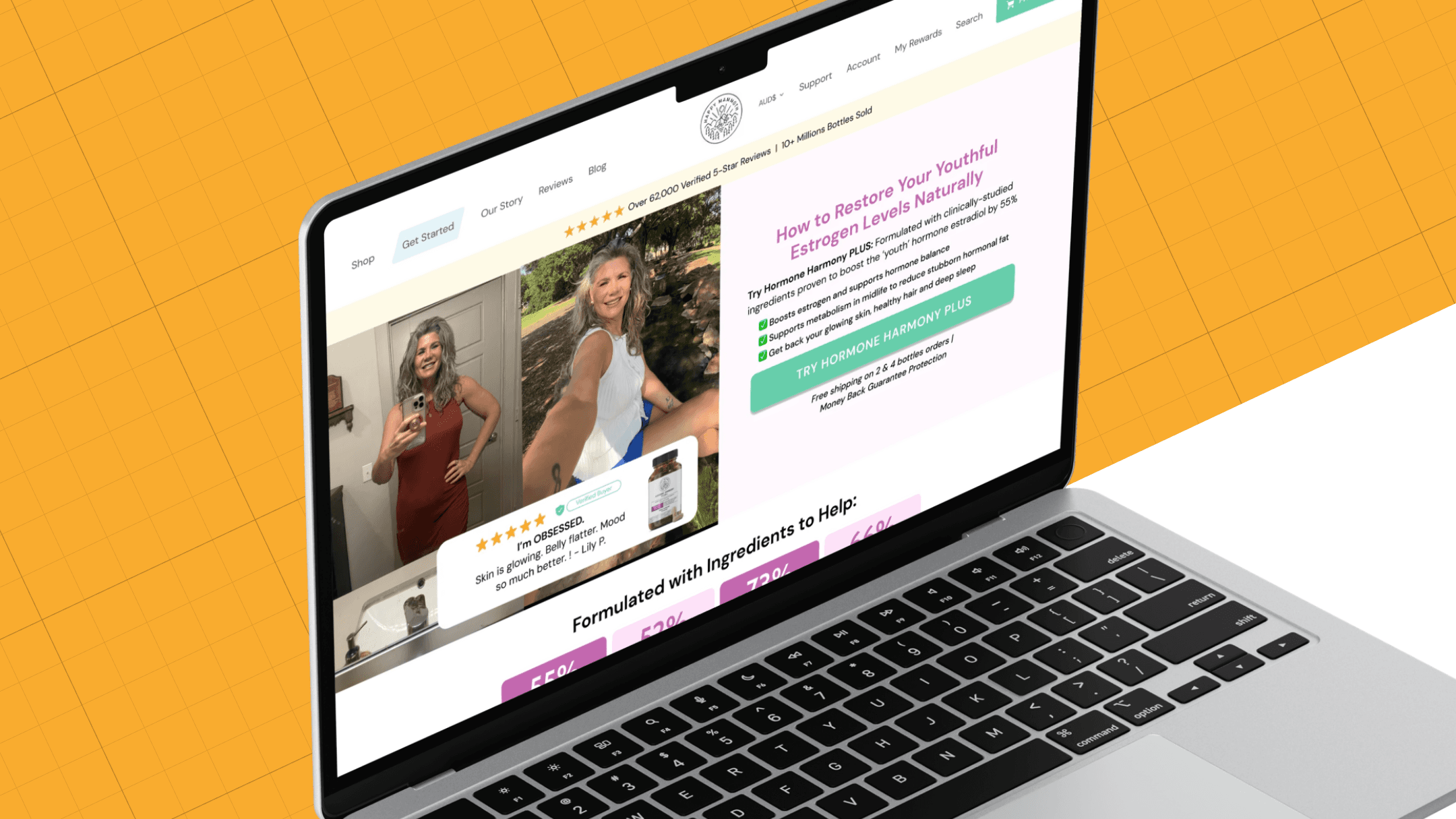
Mobile-first landing pages for multiple Happy Mammoth products. I translated campaign messaging developed with copywriters into clear visual hierarchies, reusable modules and a low-friction path to purchase.

Happy MammothLanding Pages
Landing PagesLanding Pages
ClientHappy Mammoth
RoleSenior Brand & eCommerce Designer
FocusLanding pages · Visual hierarchy · CRO-informed iteration
Date2026
Message matchMobile-firstProduct storyCRO-informedResponsive designeCommerce

The context

The ad started the conversation.

Each landing page received visitors directly from paid campaigns. Copywriters defined the campaign and product messaging; the design needed to preserve that continuity, answer questions visually and maintain momentum toward purchase.

The challenge

Specific enough to persuade. Systematic enough to scale.

Different products, audiences and approved campaign angles needed distinct visual executions without rebuilding every page from zero. On mobile, every section had to earn its place.

Landing page screen
Page

Direction and execution

Approved message. Clear visual path.Built around the decision.

Working from copy developed by copywriters, I transformed each message into visual hierarchy, modular sections and responsive page flows, then refined emphasis and placement using CRO observations.

01

Translate the approved message

I converted the campaign direction supplied by copywriters into a first screen that felt visually continuous with the ad.

Paid traffic · Message match · First fold

02

Design the mobile hierarchy

I prioritised the product, benefit, proof and CTA for small screens before expanding the layout.

Mobile first · Hierarchy · CTA

03

Place evidence with intent

Ingredients, explanations, testimonials and reassurance appeared where they could resolve the next question.

Product education · Proof · Trust

04

Refine the conversion flow

I adjusted modules, emphasis and responsive behaviour using campaign learnings and CRO observations.

Iteration · CRO-informed · Responsive QA

The page system

Reusable structure. Product-specific execution.

04 / Modules
01

Paid-traffic entry

A first fold that continues the language and visual promise of the ad.

02

Visual message hierarchy

Approved copy is translated into a clear sequence from problem and benefit to mechanism and product value.

03

Decision support

Proof, ingredients, FAQs and reassurance placed around real visitor questions.

04

Responsive modules

Reusable sections that adapt across products without becoming generic.

Selected pages

Different products. One conversion language.

A selection of page structures showing how the visual system adapts across products, approved messages and stages of the decision.

Landing page screen
Page
Landing page screen
Page
Landing page screen
Page

Mobile experience

The same approved message, rebuilt visually for the smallest screen.

Selected mobile captures showing how hierarchy, content rhythm and the purchase path adapt without changing the campaign direction.

Mobile landing page
Mobile
Mobile landing page
Mobile
Mobile landing page
Mobile
Mobile landing page
Mobile

The outcome

A repeatable frameworkfor focused product stories.

Pages that visually connect campaign intent, product education and purchase in one coherent flow.

The system made it easier to adapt layout, hierarchy and modules across products while keeping the approved messaging, mobile experience and final execution consistent.

Copywriters owned the messaging. CRO observations informed visual iteration and placement.

Next project

Beyond Alpha Design System & Website